How to stack blog pagination on mobile screens
This tutorial was recorded in Squarespace 7.1 and will not work on legacy sites built on version 7. For more information, visit insidethesquare.co/themes
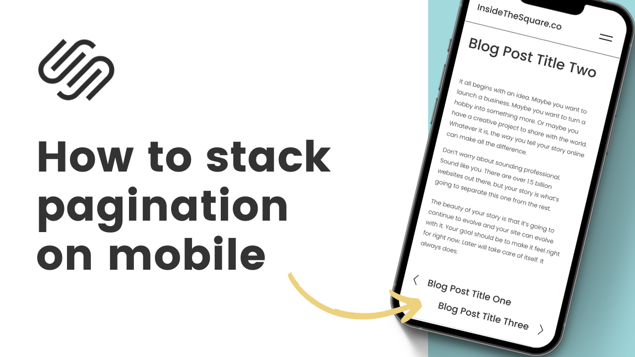
Have you noticed that the blog post pagination links that help people go to the next article look super squished on mobile screens?
Yeah, I didn’t like the look of that either, so I figured out a way to fix it. 😎
With just a few lines of CSS, you can stack your pagination link neatly on top of each other, making it a breeze for your readers to navigate your blog's content.
The codes that you need are below, but I also made you a quick tutorial video that will teach you how to use them.
A quick side note - these codes ALSO stack the pagination on a project page, so if you have a portfolio that you don’t want this look to be on, be sure to install this on the blog itself following the directions below.
@media only screen and(max-width: 640px){
.item-pagination--prev-next {
flex-direction: column!important
}

.item-pagination-link{
max-width:100%;
margin-bottom: 40px
}}
To install this code on a single blog, select the settings option next to the blog title, and click on advanced. Then select the Post Blog Item Code Injection and paste the code between style brackets like this:
<style>
  @media only screen and(max-width: 640px){
.item-pagination--prev-next {
flex-direction: column!important
}

.item-pagination-link{
max-width:100%;
margin-bottom: 40px
}
}
  </style>

