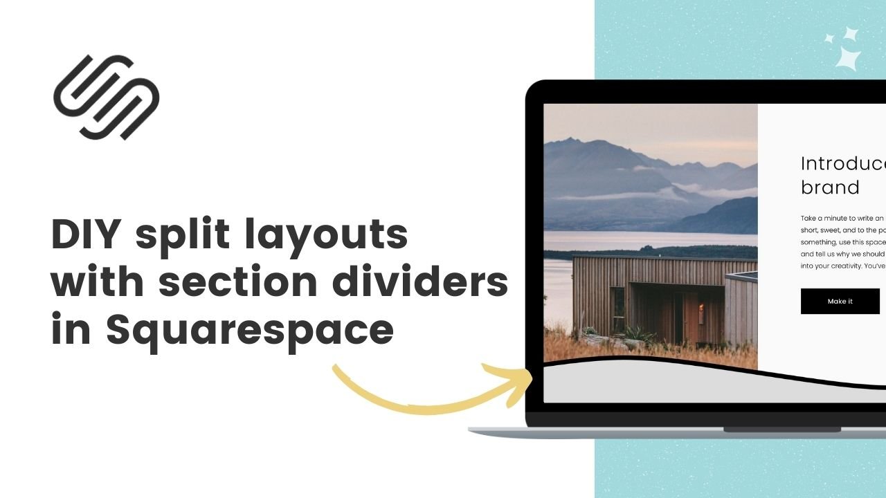
How to create a split layout with section dividers in Squarespace
Here's what you'll find in this blog post:
→ Info about this tutorial
→ Video tutorial
→ Code example
→ Related content
About this tutorial
This tutorial was recorded in Squarespace 7.1 and will not work on legacy sites built on version 7. For more information, visit insidethesquare.co/themes
Section dividers are a great new addition to Squarespace 7.1 unless you want a spilt section - text on one side and an image on the other. These dividers are placed after the content grid, so content blocks can’t reach all the way to the edge. Luckily, we can make this magic happen with custom CSS.
In this tutorial, you’ll learn how to use custom code to create a split page layout that works with section dividers, too.
There are a few important things to know about this code. First is the location - do you want the section background to be on the left or the right? If you want it on the right, you need to add extra code to scoot it to the side.
You'll need to grab the data section ID and update the code below so it will work for you. That might seem complicated, but don’t worry - I made it as easy as copy and paste! 🙌
Video tutorial
Code Example
Image on the right side of the page section:
@media only screen and (min-width: 768px){
  [data-section-id=”123456789”] .section-background{
  width:50%!important;
  margin-left:50%!important
}
}
Image on the left side of the page section:
@media only screen and (min-width: 768px){
[data-section-id=”123456789”] .section-background{
width:50%!important;
margin-right:50%!important
}
}
