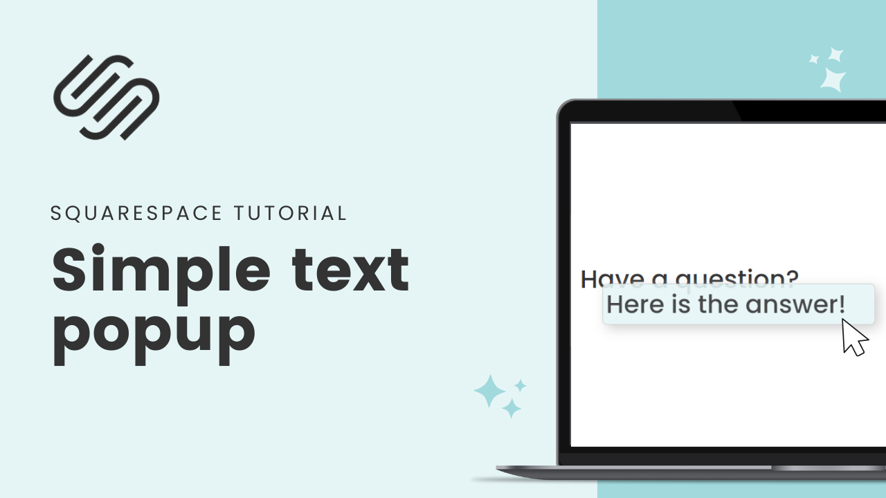
How To Create A Text Popup in Squarespace
This tutorial was recorded in Squarespace 7.1 but also applies to legacy sites built on version 7. For more information, visit insidethesquare.co/themes
Showing additional info in a popup is a great way to give visitors more information without cluttering your page. It's also an effective way to make sure your user experience is as smooth as possible.
But did you know that you can create custom text-only popup using CSS?
That’s right—with just a few lines of code, you can add unique and personalized text that’s revealed on a hover.
Often called a tooltip, you can add this simple text popup to any version of Squarespace, and any subscription level too!
This is only for text. We aren’t adding images or forms or anything else to this popup, just a simple line of text that shows up on a hover.
→ If a simple text-only popup is perfect for you, check out the video tutorial below.
→ If you want to have a popup form, check out this tutorial on lightbox form styles
→ If you want to have a lot of content in that popup like images and more, you’ll need an advanced plugin. I recommend using the one from Sqsp themes. Here is my affiliate link.
Here’s what to do:
Step 1: Add the popup
The first step is to add the HTML code that will tell Squarespace what text it should show on the page and what the popup should be. You'll want to insert this code into the section of your website where you'd like the text placed. Replace the words visible text and popup text with your own content.
<span class="text">Visible text<span class="popup">Popup text</span>
This code creates two new elements on your site. Text is displayed on your site and will trigger the popup text when hovered over by the cursor.
Step 2: Add CSS Styling
Once you've added the HTML code for your popup text, it's time to style it with CSS so that it looks great! To do this, head over to Design → Custom CSS and paste in the following code snippet:
.popup {
visibility:hidden;
/*style of the popup*/
padding: 1rem;
background-color: #e5f5f6;
border: 1px solid #ccc;
box-shadow: 5px 5px 15px #ccc;
border-radius: 6px;
opacity:.9;
/*placement of the popup*/
display: inline-block;
position:relative;
top:1rem;
left:-5%
}
.text:hover .popup {
visibility:visible;
}
You’ll want to adjust this code so it looks great with your own website. You can change the background color of the popup, the padding, the opacity, and even change the location of the popup. You can also apply additional styling elements like a border or shadow.
Step 3: Publish Your Changes
Once you've added both the HTML and CSS for your custom tooltip, publish your changes and check out how it looks on your live site!


